| Navigation: Templates > Guide to all Templates > Control Templates >====== MultiChildRelationTree Button control template ====== |    |
The MultiChildRelationTree Button control template is used with the MultiChildRelationTree control template to extend the options of any selected tree element. The idea behind this template is to specify a single button which in turn executes source from a multiple embed points based on the active secondary child table selected.
General Tab
Disable Condition
Specify a condition that will disable the button for all tree elements when evaluated to TRUE. An example of this is an “access level” that grant rights for special modifications specified by this button.
Use Button via Popup
Check this box to allow this button (when enabled) to appear on the relation tree popup menu.
Add Separation
Check this box to add a popup menu separator after the button item.
Popup Text
You can use the default button text in the popup menu, or specify via the Use Alternative Text check box different popup menu text here.
Popup Priority
The order of the popup menu item is specified by a priority number here. It is recommended to develop standards of priorities to prevent clashes or duplicates with other Relation Tree templates.
Refresh Tree After Action
After the button action is performed, check this box to force a refresh of the relation tree's contents.
Primary Level Tab
Item Options:
Enable Button
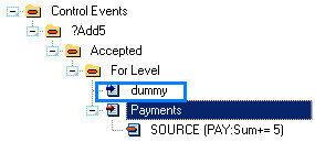
Check this box to enable this button when a primary record is active (selected). The action of this button will be controlled by the active source code of this primary table's button embed point. For example, if the primary table is called “Dummy”, you will see the following embed point become available the next time you enter the Embed window:
Disable Condition
Specify an optional condition that will disable the button for the selected primary record when evaluated to TRUE.
Allow Popup
Check this box to allow this button (when enabled) to also appear on the relation tree popup menu when a primary record is selected.
Root Options:
Enable Button on Root
Check this box to enable this button when the primary root element is active (selected).
Disable Condition
Specify an optional condition that will disable the button for the selected primary root when evaluated to TRUE.
Allow Popup on Root
Check this box to allow this button (when enabled) to also appear on the relation tree popup menu when the primary root is selected.
Child Levels Tab
The list box shown on this tab will list all child tables used in the relation tree. The following naming convention is used for each list box item.
Item: (ED)-(P) Root (ED)-(P) for <;child table name>
where E ' Enabled, D ' Disabled, P ' Popup Enabled
Item Options:
Enable Button
Check this box to enable this button when the child element is active (selected).
Disable Condition
Specify a condition that will disable the button for the selected child element when evaluated to TRUE.
Allow Popup
Check this box to allow this button (when enabled) to appear on the relation tree popup menu.
Root Options:
Enable Button on Root
Check this box to enable this button when the secondary (child) root element is active (selected).
Disable Condition
Specify an optional condition that will disable the button for the selected secondary (child) root when evaluated to TRUE.
Allow Popup on Root
Check this box to allow this button (when enabled) to also appear on the relation tree popup menu when the secondary (child) root is selected.

