| Navigation: Templates > Templates by Topic >ActiveImage template |    |
Populate an Image control and set the controls File property so it displays the image you want to use, and then use the Actions menu item to bring up the template dialog. The ActiveImage template provides functionality to your Image control so that it “mimics” – behaves similar to a Button control. Filling in these prompts causes the Image control to post the EVENT:Accepted to the original control when the image is clicked. The template uses the ActiveImage CLASS to provide the functionality. The ActiveImage CLASS is found in ActiveImage.Inc and ActiveImage.Clw.
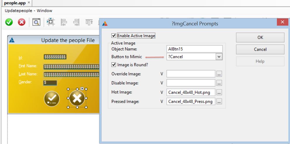
Turn on the “Enable Active Image” checkbox. Accept the default “Object Name” or change it to somethng more memorable. Use the dropdown to select the Button that the Active Image will mimic. Those are the only requirements to make the Image control an “active Image”, but you can enhance the UIX if you provide images for the Disabled, Hot and Pressed states. See below for additional details.
| Enable Active Image | Checkbox to toggle the active image template support ON/OFF |
| Object Name | [Required]Name for the object instance associated with the Image control. You can accept the default name or change it to something you will recognize easier. |
| Button to Mimic | [Required]Use the dropdown list to select the Button control that the image control will replace. The original Button is automatically hidden at runtime by the Template at runtime. |
| Image is Round? | [Optional]Checkbox to tell the template if the image is Round. The ActiveImage Class has special handling for round images. |
| Override Image | [Optional]Enter a value here to signal the template so that at runtime it replaces the image that you populated at Design time as soon as the window is opened.Press the “V” button if you intend to use a Variable so that you can set the image at runtime.Press the ellipsis button to either select a Variable from the Data pad, or to select a physical image file. |
| Disable Image | [Optional]Enter a value here if you have an image that should be displayed to represent a “Disabled” state. If you don't enter a value here and you call the iBtn.Disable() method the class sets PROP:Disable for the image control so that the image will be repainted in greyscale colors.Call the iBtn.Disable() method (or iBtn.Enable() method) to toggle the image shown, or toggle the greyscale painting on or off.where iBtn is the value specified for “Object Name” for that ActiveImage instancePress the “V” button if you intend to use a Variable so that you can set the image at runtime.Press the ellipsis button to either select a Variable from the Data pad, or to select a physical image file. |
| Hot Image | [Optional]The class/template detects when the mouse cursor is hovering over the active image and if you enter a value the class changes the Image control to display the “Hot image” specified herePress the “V” button if you intend to use a Variable so that you can set the image at runtime.Press the ellipsis button to either select a Variable from the Data pad, or to select a physical image file. |
| Pressed Image | [Optional]Enter a value here if you have an image that should be displayed to represent a “Pressed” state.When the Image control is clicked (pressed) the ActiveImage class posts an EVENT:Accepted to the original button control (the one that the Image control 'mimics').Press the “V” button if you intend to use a Variable so that you can set the image at runtime.Press the ellipsis button to either select a Variable from the Data pad, or to select a physical image file. |
see also: ActiveImage Class

